Let us create some box-and-whisker plots (henceforth, referred to simply as boxplots) using Matplotlib. At the end of the post we will have a boxplot which looks like the following.

Import the libraries and specify the type of the output file.
The first step is to import the python libraries that we will use.
## numpy is used for creating fake data
import numpy as np
import matplotlib as mpl

## agg backend is used to create plot as a .png file
mpl.use('agg')

import matplotlib.pyplot as plt
Convert the data to an appropriate format
The second step is to ensure that your data is in an appropriate format. We need to provide a collection of values for each box in the boxplot. A collection can be expressed as a python list, tuple, or as a numpy array. Once you have the different collections, one for each box, you combine all these collections together in a list, tuple or a numpy array. That is, the data for the boxplot is in the form of a list of lists, or list of arrays, or a tuple of arrays etc.
Let us create the data for the boxplots. We use numpy.random.normal() to create the fake data. It takes three arguments, mean and standard deviation of the normal distribution, and the number of values desired.
## Create data
np.random.seed(10)
collectn_1 = np.random.normal(100, 10, 200)
collectn_2 = np.random.normal(80, 30, 200)
collectn_3 = np.random.normal(90, 20, 200)
collectn_4 = np.random.normal(70, 25, 200)

## combine these different collections into a list
data_to_plot = [collectn_1, collectn_2, collectn_3, collectn_4]
Create the boxplot
The list of arrays that we created above is the only required input for creating the boxplot. Using data_to_plot we can create the boxplot with the following code:
# Create a figure instance
fig = plt.figure(1, figsize=(9, 6))

# Create an axes instance
ax = fig.add_subplot(111)

# Create the boxplot
bp = ax.boxplot(data_to_plot)

# Save the figure
fig.savefig('fig1.png', bbox_inches='tight')
This gives:
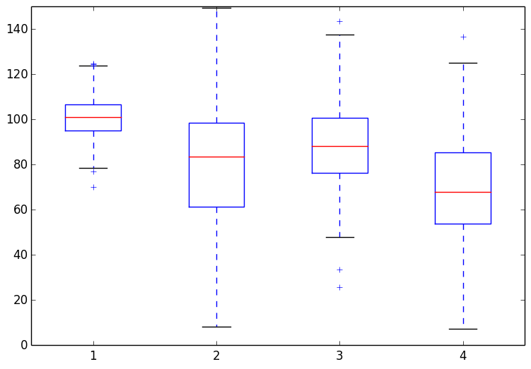
That was easy. If you are satisfied with the default choices for the axes limits, labels and the look of the plot there is nothing more to do. Most likely that is not the case and you want to customize these features. Matplotlib provides endless customization possibilities.
Change color of the boxes, whiskers, caps and the median
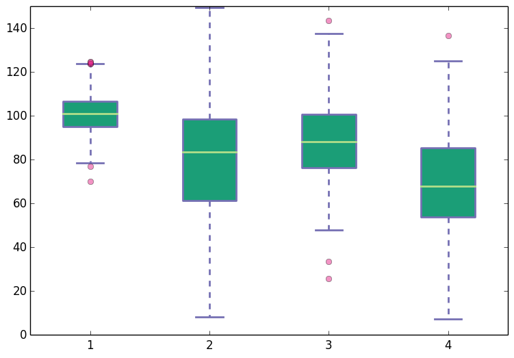
The bp variable in the code snippet above is a python dictionary with keys boxes, whiskers, caps, fliers and the median. The values in this dictionary are the geometric instances that we see in the plot. For example, the values bp['boxes'] are the polygon instances that we see as boxes; values bp['whiskers'] are the line instances that we see as whiskers. To change the colors of boxes, whiskers etc., we need to access these instances from the bp dictionary and change their properties. The code below shows how to do this. In addition to changing the colors we also increase the line width to make the differences in color easier to see. Add the following code before the fig.savefig('fig1.png', bbox_inches='tight') line in the above snippet.
## add patch_artist=True option to ax.boxplot()
## to get fill color
bp = ax.boxplot(data_to_plot, patch_artist=True)

## change outline color, fill color and linewidth of the boxes
for box in bp['boxes']:
    # change outline color
    box.set( color='#7570b3', linewidth=2)
    # change fill color
    box.set( facecolor = '#1b9e77' )

## change color and linewidth of the whiskers
for whisker in bp['whiskers']:
    whisker.set(color='#7570b3', linewidth=2)

## change color and linewidth of the caps
for cap in bp['caps']:
    cap.set(color='#7570b3', linewidth=2)

## change color and linewidth of the medians
for median in bp['medians']:
    median.set(color='#b2df8a', linewidth=2)

## change the style of fliers and their fill
for flier in bp['fliers']:
    flier.set(marker='o', color='#e7298a', alpha=0.5)
This gives:
Change x-axis labels and remove tick marks from the top and right axes.
This is easy. To do this pass a list of custom labels to ax.set_xticklabels() function. The list should have the same length as the number of boxes in the boxplot. For example, suppose instead of the default x-axis labels that we see in the plots above, we want labels 'Sample1', 'Sample2', 'Sample3' and 'Sample4'. We can modify the labels using the following line (add it before the line where the figure is saved):
## Custom x-axis labels
ax.set_xticklabels(['Sample1', 'Sample2', 'Sample3', 'Sample4'])
To remove the tick-marks from top and right spines, or rather to keep ticks only on the bottom and left axes, add the following lines to the code.
## Remove top axes and right axes ticks
ax.get_xaxis().tick_bottom()
ax.get_yaxis().tick_left()
With the custom x-axis labels and removal of top and right axes ticks, the boxplot now looks like the following:
If you are curious to learn more about creating boxplots with matplotlib, you may find the following links helpful.